What Minimum Screen Size for Responsive Sites?

Until recently I’ve been testing responsive sites down to 320px out of habit but without really knowing whether it’s worth the effort. After all, Bootstrap 3 only has media queries down to 768px and Bootstrap 4 will be 34em (roughly/often 544px).

So should we bother optimising responsive websites for 320px, 480px, 768px or bring back the 1990s with Best Viewed in 800×600

I had a play with some stat from statcounter.com to find out.

My Process

  1. Show Screen Resolutions for the 12 months up to June 2016.
  2. Filters it for data for the UK (since most of my sites are mostly visited by people in the UK)
  3. Delete all screen resolutions wider than 1000px.
  4. Combine the matching widths – ignoring heights.
  5. Plot them on a graph

The Graph

The graph has two lines – one for individual market share and one for accumulative market share (i.e. how many people have 800px or smaller).

The aim was to find where the browser width jumps to a notable proportion.
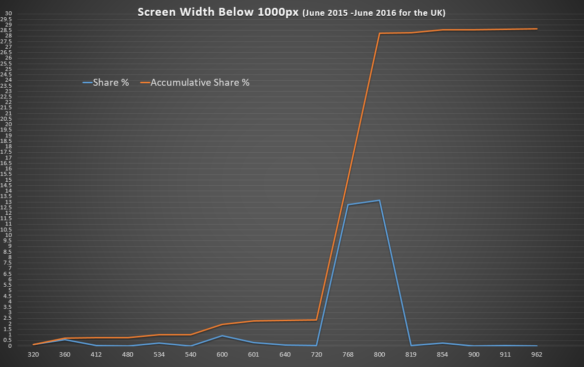
responsive-webdesign-optimisation-width

The Results

The results are fascinating! 2.5% of visits come from a browser less than 720px wide but 15% have a screen bigger than that – and nearly double that have at least 800px.

The case for a minimum 720px Width

What to optimise for depends on your market – if you’re happy with 2.5% of your visitors getting frustrated that your site does not work – then don’t bother with less than 720px.

The case for a minimum 320px Wide Responsive Site

Optimising for 320px instead of 360px will only help 0.12% (one person in every thousand) use your site better – for a small business website getting 75 hits a day that’s one person every fortnight who’ll have a less than optimal time on your site.

Finding out who (or what, if they’re bots) are using very narrow screens would also be interesting. Are these bots, browser bugs or perhaps people just making a window smaller to get it out the way for a while? If they’re not your target audience, you can forget them and spend your time making the wider-screen experience excellent.

Raw Data

If you want to have a play yourself, here’s the data formatted as CSV:

Screen Width,Share %,Accumulative Share %
320px,0.121538461,0.121538461
360px,0.576923077,0.698461538
412px,0.049230769,0.747692307
480px,0.011538462,0.759230769
534px,0.244615385,1.003846154
540px,0.01,1.013846154
600px,0.947692308,1.961538462
601px,0.293846154,2.255384616
640px,0.063846154,2.31923077
720px,0.022307692,2.341538462
768px,12.76846154,15.11
800px,13.14846154,28.25846154
819px,0.019230769,28.27769231
854px,0.266153846,28.54384616
900px,0.016923077,28.56076923
911px,0.056153846,28.61692308
962px,0.011538462,28.62846154

Feedback

I’m not statistician and other interpretations of these results might be useful. If you have any feedback or other thoughts – let me know in the comments below.

Tags:
Categories:

HTML Basics

This post intends to be a very basic introduction to HTML for people who may need to edit some code but don’t need or want to learn the everything required to build a website. If you have a WordPress site and want to make some tweaks in HTML, this is the place for you.

Terminology

Websites are built with three computer languages: HTML, CSS and JavaScript. Many other languages exist for outputting these but they all run on the server instead of in your browser and are beyond the scope of this post.

HTML is used to define different bits and content of a web page. CSS then defines how the web browser should make the HTML look (colours, layouts, fonts, sizes etc). Many websites use JavaScript to make things more interactive too.

  • HTML stands for Hyper Text Markup Language
  • CSS stands for Cascading Style Sheets
  • JavaScript is not the same as Java.

Anatomy of an HTML Tag

HTML tags are bits of code which wrap the text of the web page, they have different meanings and the CSS causes them to be displayed in different ways. HTML tags look like one of these. Pay attention to spaces and quotation marks.

  1. Self Closing: <tag_name>
  2. Simple: <tag_name>Contents<value>
  3. Regular with Attributes: <tagname attributes=”value”>Contents</tag>

Self Closing HTML Tag

Many tags don’t have any contents, they just tell the browser to do something. A classic example is a line break, if you have a paragraph (see below) and you want to force a new line somehere stick in the br tag:

 <p>The contents of the paragraph goes here<br> this text will be on a new line</p>

Simple HTML Tag

A simple HTML tag is the P tag, it defines a paragraph and you wrap it around the contents.

 <p>The contents of the paragraph goes here</p>

HTML Tag with Attributes

Another tag is the one which creates links, they’re called anchors and the tag name is a, to define where the link should point you must set the “href” attribute. Do this by adding a space after the tag name, putting the attribute name (href) followed by a space and the value for that attribute. You normally want to surround the attribute value with quotes – either single ” or double ‘ are fine.

 <a href="http://www.google.com">Click here to visit Google</a>

Simple HTML tag with CSS Class

CSS works by applying styles to HTML tags which match various types of attribute. A common one is the class. If your web developer has written code to make some links (Anchors) look like buttons you probably just need to add the right class. For example:

 <a class="button" href="http://www.google.com">Click this button to visit Google</a>

Note that you (or someone) will need to have written some CSS to make that class=”button” do anything, check with your designer/developer to find out what your options are for styling things with classes.

Tags:
Categories:

Full Width Inline x-editable Elements

I’ve been using x-editable inline components for a project and wanted them rather than being the default tiny width they normally are, to take the full wonderful responsive width of their Bootstrap parents.

The CSS


/* Make inline editables take the full width of their parents */
.editable-container.editable-inline,
.editable-container.editable-inline .control-group.form-group,
.editable-container.editable-inline .control-group.form-group .editable-input,
.editable-container.editable-inline .control-group.form-group .editable-input textarea,
.editable-container.editable-inline .control-group.form-group .editable-input select,
.editable-container.editable-inline .control-group.form-group .editable-input input:not([type=radio]):not([type=checkbox]):not([type=submit])
{
    width: 100%;
}

This just gives 100% width to most of the containers between the editable-container and the element itself, it also excludes radio and checkbox inputs since they don’t usually want their widths playing with.

Don’t forget to include this after your xeditable CSS files.

Before x-editable full-width inline CSS

Before applying the full-width CSS

After x-editable full-width inline CSS

After applying the full-width CSS

After applying the full-width CSS

Nice and tidy, eh?

If I’ve missed anything, or you find something that this breaks – let me know in the comments!

Tags:
Categories: