Until recently I’ve been testing responsive sites down to 320px out of habit but without really knowing whether it’s worth the effort. After all, Bootstrap 3 only has media queries down to 768px and Bootstrap 4 will be 34em (roughly/often 544px).
So should we bother optimising responsive websites for 320px, 480px, 768px or bring back the 1990s with Best Viewed in 800×600
I had a play with some stat from statcounter.com to find out.
My Process
- Show Screen Resolutions for the 12 months up to June 2016.
- Filters it for data for the UK (since most of my sites are mostly visited by people in the UK)
- Delete all screen resolutions wider than 1000px.
- Combine the matching widths – ignoring heights.
- Plot them on a graph
The Graph
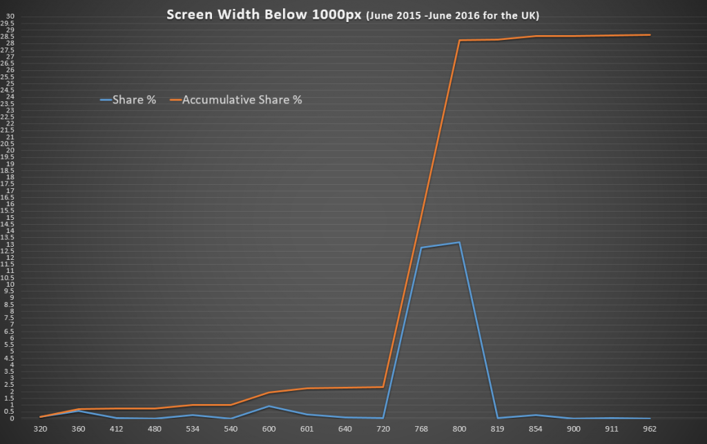
The graph has two lines – one for individual market share and one for accumulative market share (i.e. how many people have 800px or smaller).
The aim was to find where the browser width jumps to a notable proportion.
The Results
The results are fascinating! 2.5% of visits come from a browser less than 720px wide but 15% have a screen bigger than that – and nearly double that have at least 800px.
The case for a minimum 720px Width
What to optimise for depends on your market – if you’re happy with 2.5% of your visitors getting frustrated that your site does not work – then don’t bother with less than 720px.
The case for a minimum 320px Wide Responsive Site
Optimising for 320px instead of 360px will only help 0.12% (one person in every thousand) use your site better – for a small business website getting 75 hits a day that’s one person every fortnight who’ll have a less than optimal time on your site.
Finding out who (or what, if they’re bots) are using very narrow screens would also be interesting. Are these bots, browser bugs or perhaps people just making a window smaller to get it out the way for a while? If they’re not your target audience, you can forget them and spend your time making the wider-screen experience excellent.
Raw Data
If you want to have a play yourself, here’s the data formatted as CSV:
Screen Width,Share %,Accumulative Share %
320px,0.121538461,0.121538461
360px,0.576923077,0.698461538
412px,0.049230769,0.747692307
480px,0.011538462,0.759230769
534px,0.244615385,1.003846154
540px,0.01,1.013846154
600px,0.947692308,1.961538462
601px,0.293846154,2.255384616
640px,0.063846154,2.31923077
720px,0.022307692,2.341538462
768px,12.76846154,15.11
800px,13.14846154,28.25846154
819px,0.019230769,28.27769231
854px,0.266153846,28.54384616
900px,0.016923077,28.56076923
911px,0.056153846,28.61692308
962px,0.011538462,28.62846154
Feedback
I’m not statistician and other interpretations of these results might be useful. If you have any feedback or other thoughts – let me know in the comments below.
