Category Archives: CSS

Pixel Density vs CSS

Pixel Density. This post is part sharing my research over the past few weeks, and part continuing it by requesting your feedback in the comments below.

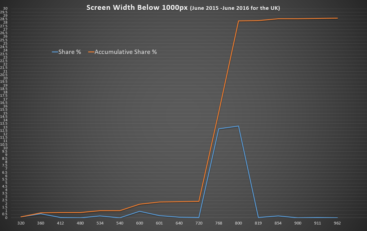
Years ago everyone got excited for Retina and it’s high density pixels. Now every smart phone has it’s own configuration all the up to a Sony with 806ppi (a PC monitor usually has 72px).

The question is – how do we accommodate this so a phone can look awesome and a PC can still load fast and efficiently.

Vectors

The real answer, it seems, is to use vectors wherever possible. SVG support is here in all recent versions of all major browsers. Perfect for icons and fancy elements.

HTTP2 Push means we don’t even need to sprite them, but you still can if you wish.

Fonts are vectors, CSS is all vectors. Looking good.

Bitmaps

For bitmaps – photos and graphics – we have srcset so we can tell the browser which sizes of the image are available, and let the device pick the best size (based on pixel density, network speed, user preference – amazing!). Srcset works everywhere except IE (but srcset falls back to the old src way anyway, so no difference).

The PX Value in CSS

The big question is what do we do with “px” values in CSS – which are increasingly meaningless. They could just become an arbitrary CSS value which devices calculate against their Pixel-Ratio and that may well work forever.

Another possibility is do we use Viewport values for everything – one viewport value is 1% of the width or height of the viewport. It’s an exciting new value!

And guess what? Viewport Units are already widely supported!

Conclusion

In short: The situation is pretty great  🙂 The PX value is probably going to stick around for a bit (unless I’ve totally missed something) but devices know that and they’re happy to accommodate you for now.

Other Questions?

If you have other comments, or questions, leave them in the comments below.


Categories:

What Minimum Screen Size for Responsive Sites?

Until recently I’ve been testing responsive sites down to 320px out of habit but without really knowing whether it’s worth the effort. After all, Bootstrap 3 only has media queries down to 768px and Bootstrap 4 will be 34em (roughly/often 544px).

So should we bother optimising responsive websites for 320px, 480px, 768px or bring back the 1990s with Best Viewed in 800×600

I had a play with some stat from statcounter.com to find out.

My Process

  1. Show Screen Resolutions for the 12 months up to June 2016.
  2. Filters it for data for the UK (since most of my sites are mostly visited by people in the UK)
  3. Delete all screen resolutions wider than 1000px.
  4. Combine the matching widths – ignoring heights.
  5. Plot them on a graph

The Graph

The graph has two lines – one for individual market share and one for accumulative market share (i.e. how many people have 800px or smaller).

The aim was to find where the browser width jumps to a notable proportion.

responsive-webdesign-optimisation-width

The Results

The results are fascinating! 2.5% of visits come from a browser less than 720px wide but 15% have a screen bigger than that – and nearly double that have at least 800px.

The case for a minimum 720px Width

What to optimise for depends on your market – if you’re happy with 2.5% of your visitors getting frustrated that your site does not work – then don’t bother with less than 720px.

The case for a minimum 320px Wide Responsive Site

Optimising for 320px instead of 360px will only help 0.12% (one person in every thousand) use your site better – for a small business website getting 75 hits a day that’s one person every fortnight who’ll have a less than optimal time on your site.

Finding out who (or what, if they’re bots) are using very narrow screens would also be interesting. Are these bots, browser bugs or perhaps people just making a window smaller to get it out the way for a while? If they’re not your target audience, you can forget them and spend your time making the wider-screen experience excellent.

Raw Data

If you want to have a play yourself, here’s the data formatted as CSV:

Screen Width,Share %,Accumulative Share %
320px,0.121538461,0.121538461
360px,0.576923077,0.698461538
412px,0.049230769,0.747692307
480px,0.011538462,0.759230769
534px,0.244615385,1.003846154
540px,0.01,1.013846154
600px,0.947692308,1.961538462
601px,0.293846154,2.255384616
640px,0.063846154,2.31923077
720px,0.022307692,2.341538462
768px,12.76846154,15.11
800px,13.14846154,28.25846154
819px,0.019230769,28.27769231
854px,0.266153846,28.54384616
900px,0.016923077,28.56076923
911px,0.056153846,28.61692308
962px,0.011538462,28.62846154

Feedback

I’m not statistician and other interpretations of these results might be useful. If you have any feedback or other thoughts – let me know in the comments below.

Tags:
Categories:

Firefox devtools.responsiveUI.presets Settings for Bootstrap 3

The ResponsiveUI tool in Firefox makes testing CSS Media Queries super easy, it comes with some presets which I’m sure mean something to somebody but since I work mostly in Bootstrap I wanted to have some easy to access Bootstrap presets in there.

Setting devtools.responsiveUI.presets

  1. In a new window or tab type about:config into the address bar and hit Enter.
  2. Heed the warning about dragons
  3. In the Search box type “responsiveUI”
  4. Double click on the preference named devtools.responsiveUI.presets and then copy & paste the code below into it.
    1. If you can’t see devtools.responsiveUI.presets either create it as a a string, or save a preset from the ResponsiveUI mode in Firefox which will create the key with a value for you to replace.
  5. Disable Responsive UI View, refresh the page, then re-enable the responsive view for the settings to take effect.

devtools.responsiveUI.presets Bootstrap Settings

Double click to select all:

[{"key": "bootstrap-xs-max","name": "Bootstrap: Extra Small Max (xs)","width": 767,"height": 1000},{"key": "bootstrap-sm-min","name": "Bootstrap: Small Min (sm)","width": 768,"height": 1000},{"key": "bootstrap-sm-max","name": "Bootstrap: Small Max (sm)","width": 991,"height": 1000},{"key": "bootstrap-md-min","name": "Bootstrap: Medium Min (md)","width": 992,"height": 1000},{"key": "bootstrap-md-max","name": "Bootstrap: Medium Max (md)","width": 1199,"height": 1000},{"key": "bootstrap-lg-min","name": "Bootstrap: Large Min (lg)","width": 1200,"height": 1000}]

Using the Bootstrap Settings

There’s a setting for the smallest and largest Bootstrap Grid breakpoints, and each one between has two – a Min and a Max – to show you the two extremes for each size band.

More devtools.responsiveUI.presets Options

Tags:
Categories:

Full Width Inline x-editable Elements

I’ve been using x-editable inline components for a project and wanted them rather than being the default tiny width they normally are, to take the full wonderful responsive width of their Bootstrap parents.

The CSS


/* Make inline editables take the full width of their parents */
.editable-container.editable-inline,
.editable-container.editable-inline .control-group.form-group,
.editable-container.editable-inline .control-group.form-group .editable-input,
.editable-container.editable-inline .control-group.form-group .editable-input textarea,
.editable-container.editable-inline .control-group.form-group .editable-input select,
.editable-container.editable-inline .control-group.form-group .editable-input input:not([type=radio]):not([type=checkbox]):not([type=submit])
{
    width: 100%;
}

This just gives 100% width to most of the containers between the editable-container and the element itself, it also excludes radio and checkbox inputs since they don’t usually want their widths playing with.

Don’t forget to include this after your xeditable CSS files.

Before x-editable full-width inline CSS

Before applying the full-width CSS

After x-editable full-width inline CSS

After applying the full-width CSS

After applying the full-width CSS

Nice and tidy, eh?

If I’ve missed anything, or you find something that this breaks – let me know in the comments!

Tags:
Categories: