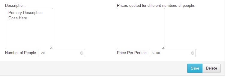
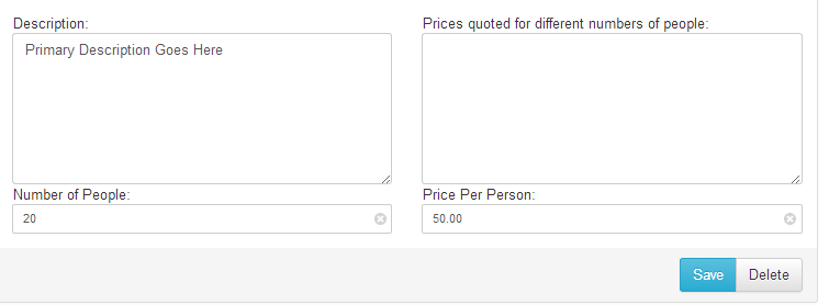
I’ve been using x-editable inline components for a project and wanted them rather than being the default tiny width they normally are, to take the full wonderful responsive width of their Bootstrap parents.
The CSS
/* Make inline editables take the full width of their parents */
.editable-container.editable-inline,
.editable-container.editable-inline .control-group.form-group,
.editable-container.editable-inline .control-group.form-group .editable-input,
.editable-container.editable-inline .control-group.form-group .editable-input textarea,
.editable-container.editable-inline .control-group.form-group .editable-input select,
.editable-container.editable-inline .control-group.form-group .editable-input input:not([type=radio]):not([type=checkbox]):not([type=submit])
{
    width: 100%;
}
This just gives 100% width to most of the containers between the editable-container and the element itself, it also excludes radio and checkbox inputs since they don’t usually want their widths playing with.
Don’t forget to include this after your xeditable CSS files.
Before x-editable full-width inline CSS
After x-editable full-width inline CSS
Nice and tidy, eh?
If I’ve missed anything, or you find something that this breaks – let me know in the comments!

